Monday, 16 December 2013

Shutter speed Evaluation


Shutter speeds effect how clear the image is depending on the thing in the image. E.g. if it is a person running it should be at about 250 but if it’s a bike it should be 600. You would use a fast shutter speed to take a picture of a fast moving object like a car. Where as if it was a slow shutter speed it would be a person walking or jumping. Shutter speeds are very important for making sure that the picture is not distorted and is clear.

The problems the image could have would be because the objects are moving, it can be very hard to keep focus of the picture. If the camera is not in focus this will make the picture blurry and hard to see. Also because they are moving it is important to check the images after to see if you need to take some more. Finding the problems in the pictures is essential to you can correct them straight away.

One issue could be underexposure; this is when not enough light comes in through the camera lenses. This can cause problems because the sun could be to bright and you cannot focus on a specific point but it could also be too dark. This could happen when using a very short shutter speed; there was not enough time for an adequate amount of light to get through to the picture. Although the speed has to be shorter to correctly capture the movement in the image, a balance of the aperture and the shutter speed helps this balance be perfect as you can change the amount of light the camera lets through. Also letting the sun come in a certain angle can change how light or dark the picture is.

Also to solve these problems you could retake the image as a slower shutter speed but at the same time this may not work; simply because it might then be to slow to catch the thing in motion. You could retake the picture at a different time of day so that the light could either hit behind or even in front of the person. You could even increase the IOS speed on the camera so it makes it more focused.

Another problem you could have would be poor framing this is when the hands are cut of or body parts are missing or even that the subject is too far away so you cannot tell it is a frame shot. To solve this problem there are many different ways you could do it. For example you should review your image straight away after so that if it hasn’t worked everyone is still in same place and you can move them a little so you can get a better photo. The cause could have been you were taking it to quickly; you should just take your time and take the picture when you think it is in the perfect place. If the person is moving take several shots in a row so you have a lot more to choose from. 


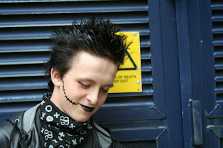
This picture i think worked really well, i put this at- 1/500 because he was moving quiet fast and this meant if it was any lower it would not have worked. i choose this shutter speed so it was not blurry and caught the picture at the right time. i used manual focus so i could make sure it was a clear picture although it is harder than using automatic it can sometimes make a better picture.


In design


This is my indesign work i made lots of different column and added boxes to put my pictures in. to place my pictures i first saved them and the went to file place and then it let me choose the image of my choice i also decided to fit the text around the image by going around the image and getting it into different shapes so i can design around that. i picked a suitable font and i actually edited the picture of the rose with the ring original the ring and the rose where two separate pictures but on photoshop i put them together.  

Thursday, 12 December 2013

Christmas album

Christmas Album

To do this i had to down loads some brush tools and think of a name for a band. to download the brush tools i had to go on brusheezy and click download after that i had to go copy it from my downloads to my personal folder. then i clicked on load brushes in photoshop and this aloud me to pick what brushes i wanted to upload. i then used these to create my album front cover. i used the paint bucket tool to paint the reindeer and used the gradient tool for the back ground i then used snowflake and antler brushes. 

Friday, 18 October 2013

Heal brush tool

             ZOE BEFORE                                                                                       ZOE AFTER


i used the heel brush tool on photoshop to edit blemishes.
i had to make a new document and past the picture on. i then had to click the heeling brush tool and get rid of all the spots and blemishes. I changed the setting from 'currant layout' to 'all layers'. I did this as it allowed  me to delete mistakes easily. Then i actually started to get rid of the spots on zoe. i had to use the alt key and click every time i covered a spot because she had different colours and shades around her face. Then Zoe's face was clear and smooth.

Friday, 11 October 2013

Composition techniques

These are my pictures of different camera angles, the ones I have tried to use is the rule of three, line, close up, extreme close up, medium long shot, tilt up, down tilt, framed. I have tried to use all of theses because I think they are interesting and different. I wanted the pictures to have a certain light to them. This is why I took most of them outside to try and get the right effects on the pictures.

This is a picture took at a down tilt angle, I like the use of light on this and I think it is different because it is not a person it is flowers and it focused really well. I think this angle works well because it is looking directly on to the flowers.
This was a close up and I thought it worked well, although there was a lot of light so the picture did not come out as clear as I wanted it to. I still like the fact it focused on his face and blurred out the back ground. it was also the side of his face so it was not head on so this effected where the light was hitting as it was right in front but I wanted a shadow effect on one half of his face.  
This picture is an extreme close-up, it shows a lot of detail in his face. you can really see how he feels through his eyes,  although it is a very bright photo you can still see this detail in his eyes. This was not one of my favourite pictures as it didn't say a lot or have much about it but i think it is a good example of an extreme close-up.
This is a line shot because of the length in his leg and it draws you from one place to the next. it is also a tilt up shot, this means that we don't see his face as much so it is more about his body language than his facial expressions. the light it directly above him making his jacket and face light up. I like this shot because i felt it worked well because it is interesting.


This is a long shot with a frame. the door way is the frame and it is from fairly far away. I also think there is an element of line in this. I think this because the wall leads up to the door steps. The use of light and dark I think is good because half of the picture is not very light because of the shading of the tree. 

This picture is a frame shot, although there is nothing in the frame (doorway) there is a still a frame in the picture, this could then have someone coming out and we could zoom into the frame. it is not focused properly and the lighting is not quiet right because it was in doors and it was a medium long shot. because we had it on manual we had to focus it out self so this was interesting and there were a few faults but I think I managed to take some good focused shots.

Thursday, 26 September 2013

photoshop


Photoshop

I used quiet a few tools on Photoshop I used fill tools and changed the letter fonts and the colours by using boss and changing the light on the words. The font i used was called script MT bold. I was adding shadows and making sure that the words did not get lost in the background. I changed the back ground to sepia this was so it fit well with the colours I was using and didn’t stand out too much. Although the model was the main subject of the magazine I wanted the lettering to have quiet a big part in the front cover. I used new layers so I could add a bar code and also I have tried to make the background have a better contrast. I found most of it easy to use as I did a lot of it in graphics but I got a bit confused trying to change it to sepia. I thought my text was well controlled and I added angles on to it to make it more energetic. I did not cut out any images. I added drop shadows on my words and I did this by going to edit and picking drop shadow and I made it big and I could put it where I wanted to.

I did not download any fonts although I wanted to a found a nicer one in the fonts that were already there in word. I used reds, whites, blacks and browns I thought these three colours went well together because they contrast well. I would if I could improve it I would try to take some of the colour from the picture and add it to the back ground also the lay out would have been different if I had took the picture a little bit further a way. It looks very similar to my flat plan but it is not the same. I thought it strengths were that it was bold and could be read easily but it was not to crowded I think I my target audience would be happy with this magazine front cover. 

photography angles/focus


Photography

I used manual focus on the camera this was so I could focus it my self and make sure it was the focus I wanted. Although this does mean that there where some that where blurry I needed to show my skills with the camera. I didn’t learn loads of new things because I did a lot of photography in graphics but I am hoping to learn more things as we geo further on in my media classes. I learnt that the t stance really lets you get the angle you want on the picture; you can lung forward and get closer to the model. I learnt that it’s slightly harder to take a photo portrait than land cape because you have to hold the camera in a different position to what you are used to.  If I had done my photo landscape it would not of worked because it would have been too short for my magazine. I did take one image landscape and then when I tried to put in on Photoshop it didn’t work, as it would miss half of the background of the magazine. Most of my images where in focus, 1 in 7 where not this is because I didn’t quiet get it right with the zoom and I moved slightly.


I learnt that there are three different types of lighting – back this is where the sun is behind, Side this is where the light is from one side so it gives a shadow to one half of the face. Front this is where the light is shining directly above or in front of the subject. We used a lot of font lighting for our photos but there are a few that have back lighting. We thought that side lighting would not work because we wanted him to look powerful. They where well composed in all of the photos and most of the shots where at the right eye line. We tried several different backgrounds e.g. trees and walls; this was to make it look more authentic. It causes a problem a little with the trees as it was covering the light too much. I made sure my subject was focused and made sure he was really involved in the photo and made him look important. I think my people skills where ok I think I could have been a little bit calmer but I really wanted to get the shots right.