Photoshop
I used
quiet a few tools on Photoshop I used fill tools and changed the letter fonts
and the colours by using boss and changing the light on the words. The font i used was called script MT bold. I was adding
shadows and making sure that the words did not get lost in the background. I
changed the back ground to sepia this was so it fit well with the colours I was
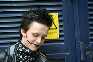
using and didn’t stand out too much. Although the model was the main subject of
the magazine I wanted the lettering to have quiet a big part in the front
cover. I used new layers so I could add a bar code and also I have tried to
make the background have a better contrast. I found most of it easy to use as I
did a lot of it in graphics but I got a bit confused trying to change it to
sepia. I thought my text was well controlled and I added angles on to it to
make it more energetic. I did not cut out any images. I added drop shadows on
my words and I did this by going to edit and picking drop shadow and I made it
big and I could put it where I wanted to.
I did
not download any fonts although I wanted to a found a nicer one in the fonts
that were already there in word. I used reds, whites, blacks and browns I thought
these three colours went well together because they contrast well. I would if I
could improve it I would try to take some of the colour from the picture and
add it to the back ground also the lay out would have been different if I had
took the picture a little bit further a way. It looks very similar to my flat
plan but it is not the same. I thought it strengths were that it was bold and
could be read easily but it was not to crowded I think I my target audience
would be happy with this magazine front cover.


